2013 Oct 30
By Krazy Kitty - Permalink
The new version of Dotclear, 2.6, which should be published in about two weeks (unless a blocker bug is detected but not fixed by then), sports a brand new administration interface; new in looks, and new in a few of its features. In the following entry and two more posts after that, we will present you what has changed since the last stable version (2.5.3).
Graphic design and ergonomics
An admin console adapted to all screens
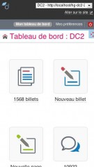
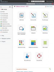
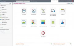
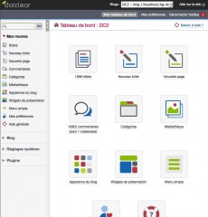
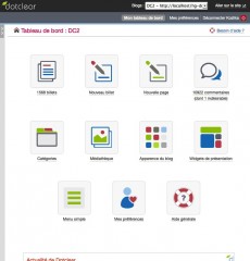
As announced when 2.6-RC came out, Dotclear has a brand new look. New color palette, new icons, new forms, and, last but not least, the administration console adapts itself to the size of your screen. Here's what it looks like on a cell phone, on a tablet and on a computer screen:
A retractable menu
In order to make the most out of your screen, we have made the left menu retractable. It can be unfolded or collapsed by clicking the vertical band bordering it to the right:
A new visual identity
The new visual identity is presented in details as an appendix to the documentation embedded in your Dotclear installation. This can be very useful to those of you who develop plugins and configurable themes. To display it, go from any help block to the global help > Documentation développeurs > Conventions (bottom right box) > Charte des pages de l'administration. (We're working on a full translation of the documentation, I promise.)
A permanently available search function
You will also note the search box that appeared on top of the main menu. It is therefore always available. For now, it can only search through blog entries, but in the future it will be extended to make it possible to search through all contents.
A contextual help for each page
The contextual help has been enriched: you will from now on find help for every single admin page. Help is accessible through a link in the upper right corner of each page, illustrated by a small life buoy icon.
Development and code
There's also been many modifications and improvements on the development side of things. Particular care was put into introducing a minimal amount of mandatory modifications for developers. Most of the known plugins have been tested with this new version and work perfectly fine. A large number of them have already been adapted to integrate those changes as well as possible.
Items organization in the global menu
The global menu is, as before, divided in "Blog", "System" and "Plugins", but the organization has been updated to be more logical from the user's point of view:
- "Blog" contains the features that pertain to blog contents and the plugins that act or are set on a per blog basis;
- "System" contains the features related to the settings of the global installation;
- "Plugins" contains global plugin settings.
Multiple plurals
Some languages have plural forms that differ from those of French, or multiple such forms. For example, zero is plural in English and singular in French; Russian has three forms of plural while French only has one. Dotclear can now deal with these specificities.
And more...
You'll find on this page (currently only available in French) an exhaustive overview of what has changed for developers.
Recently updated plugins take those changes into account. If you are a plugin author, think about it for your next update!
Comments
Looks very sexy!
Thanks Krazy Kitty for the English version of the presentation.